I promised I’d get some screenshots up of what I’m working on. Let me know what you think! Basically this is a rebuild of the visual framework using bootstrap 4, and the search bar lets you use the arrow keys to select a game now. I’ve brought the filters back, and made things on the backend a ton faster (which you obviously can’t see from screenshots). It might not be visually a ton different, but a lot has happened. I’m hoping to get this out very soon. I’m also thinking about making the dark theme available for everyone and adding a different Gold features like cloning shelves. What do you guys think?
12 Likes
It looks awesome!
I love the filters on the left. Nice work.
It may be expensive and time consuming, just throwing this out there, what do you think about a merch store? And Gold members could get a small discount off items. I would happily buy some stickers, a mug, and a shirt, among other things 
I can also think of some members who would love a shirt, like you made up years ago. I would fork over some cold hard cash for Grouvee swag.
2 Likes
Agreed with @8BitHero, it looks great. I like that it is not a massive redesign away from the layout we re familiar with and that it adds excellent features in a very pleasing way. From what I can glean from the images this looks like it will be a welcome revamp that will be enjoyable to use.
2 Likes
I see the “Post a Status” button up top, is that going to replace the open text box we have now?
BTW, agree with the others. The filters look great! They’re in a prominent spot and seem to be pretty self-explanatory to me. Is the filter affected by scroll? i.e. if you scroll down, will it stay locked so you can always see it? Or do you have to scroll back up to look at the filters again?
As for Grouvee Gold, I’ve got no ideas sorry, but I’m still happy to continue chipping in, whatever you decide on for Gold.
2 Likes
If there was a way for me to put up an on demand type store, I’d definitely do it. I think there’s enough interest it’d probably worth whatever fees some of these stores would probably charge. The problem is I’m bad at designing things, so my shirts and stuff would probably be kind of boring 
2 Likes
Yeah, I think I’m either going to take you to another page to post a status, or pop up a dialog. I don’t know why I’ve never liked having the whole editor on the front page at the top like that. Maybe I could make it look nicer and kind of put it up top like the Twitter desktop site.
The filters don’t stay locked as you scroll currently, but I like that idea. They probably should.
Literally the only other Gold idea I’ve had is cloning shelves, and that was probably @anarchistica’s idea that I’m just stealing
2 Likes
Cloning other people’s shelves?
Dude, I bet you could design a killer coffee mug! Just the G logo on a gray mug. Extra large size for those heavy coffee drinkers.
1 Like
Personally, I’ve never minded the text editor as it is now. IMO, keeping the text editor on the same page is best. Having the button redirect you to another page is adding an extra step that’s not needed. But maybe you have another reason for it I haven’t thought of?
3 Likes
Looks really good!
In regards to merch I’d suggest somewhere like RedBubble. It’s very easy to use, basically you just upload the designs then people can go onto the site and order what they like. RedBubble takes care of the printing/ shipping for a small cut of a sale price. Also, and I think this is VERY important, they are also able to send their stuff out locally from several countries (US, UK, Australia, probably others) so shipping isn’t astronomical for international folks.
3 Likes
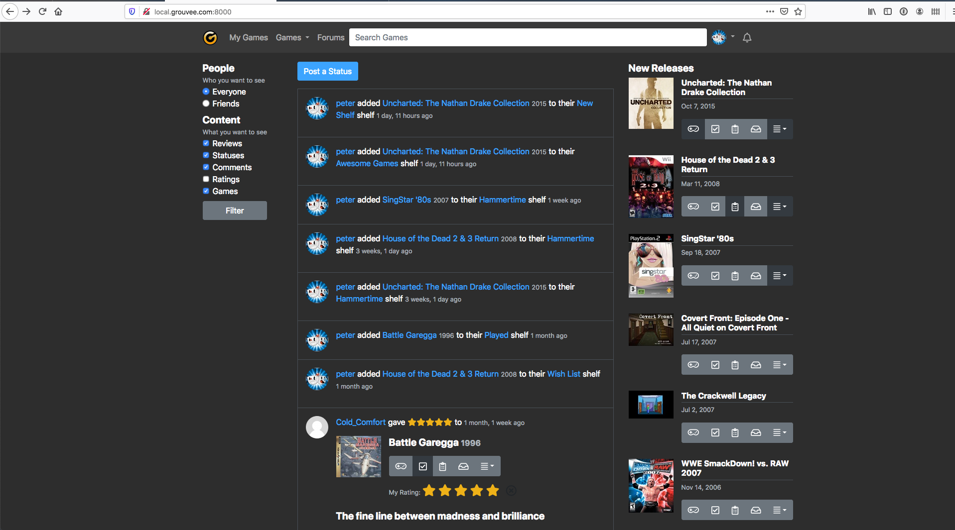
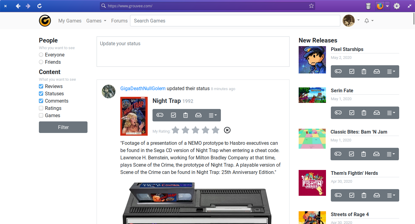
OK, the new front page is out in the wild!!!
Please let me know what you think. Let me know if it seems like it’s super slow for some reason, or if anything has broken that I’m not seeing. I realize that the image upload isn’t working on the editor on the front page. I’ll get that taken care of ASAP.
Thanks for all of your patience. Anyone who has been asking for other features, I’ll be able to get to those sooner now that this thing is out and off my chest.
4 Likes
It looks good! I like it a lot.
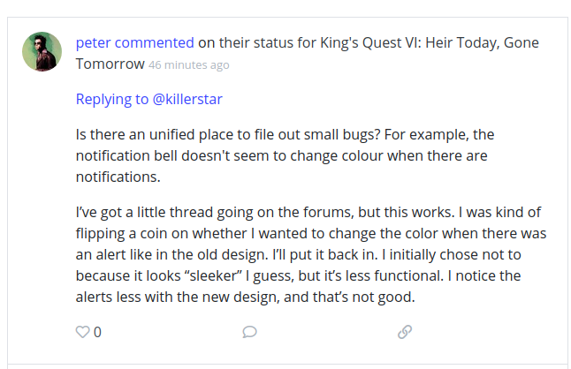
I noticed that replies in the frontpage don’t distinguish well quotes from the actual reply. Here’s a screenshot of what I mean.
3 Likes
Got the quotes thing fixed and changed the alerts to have color around them too. Keep the comments coming!
2 Likes
The new alert icon with the orange colour looks phenomenal. 
1 Like
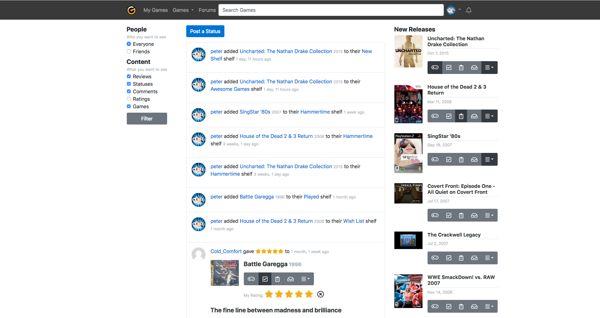
Hmm, there are two problems IMO: a) it’s too bright and b) it’s too small. I’ve got a widescreen monitor and almost half of it is white space.
What i would like:
- Filters to the far left.
- Light-gray columns on the far sides to make it less bright.
- Lighter gray on the buttons (playing, played, etc.) to make them less dark.

- Show new releases like other frontpage items and allow them to be filtered out.
- Break up posts with lines between stuff. E.g.: Pete gave x stars to game. Line. Game entry. Line. Title of review and specified release. Line.
- Allow us to hide posts by chosen users.
- Language filter. I can read French and even Spanish to some degree but Russian?
It looks really slick though.
2 Likes
Do you mind taking a screenshot? I have a normal 24” monitor, and I’m curious what it looks like to you. I think I know what all your points say, but I’d love to see what you see. I think all your ideas are trés bon, mais je ne pense pas that the language filters are going to happen anytime soon.
1 Like
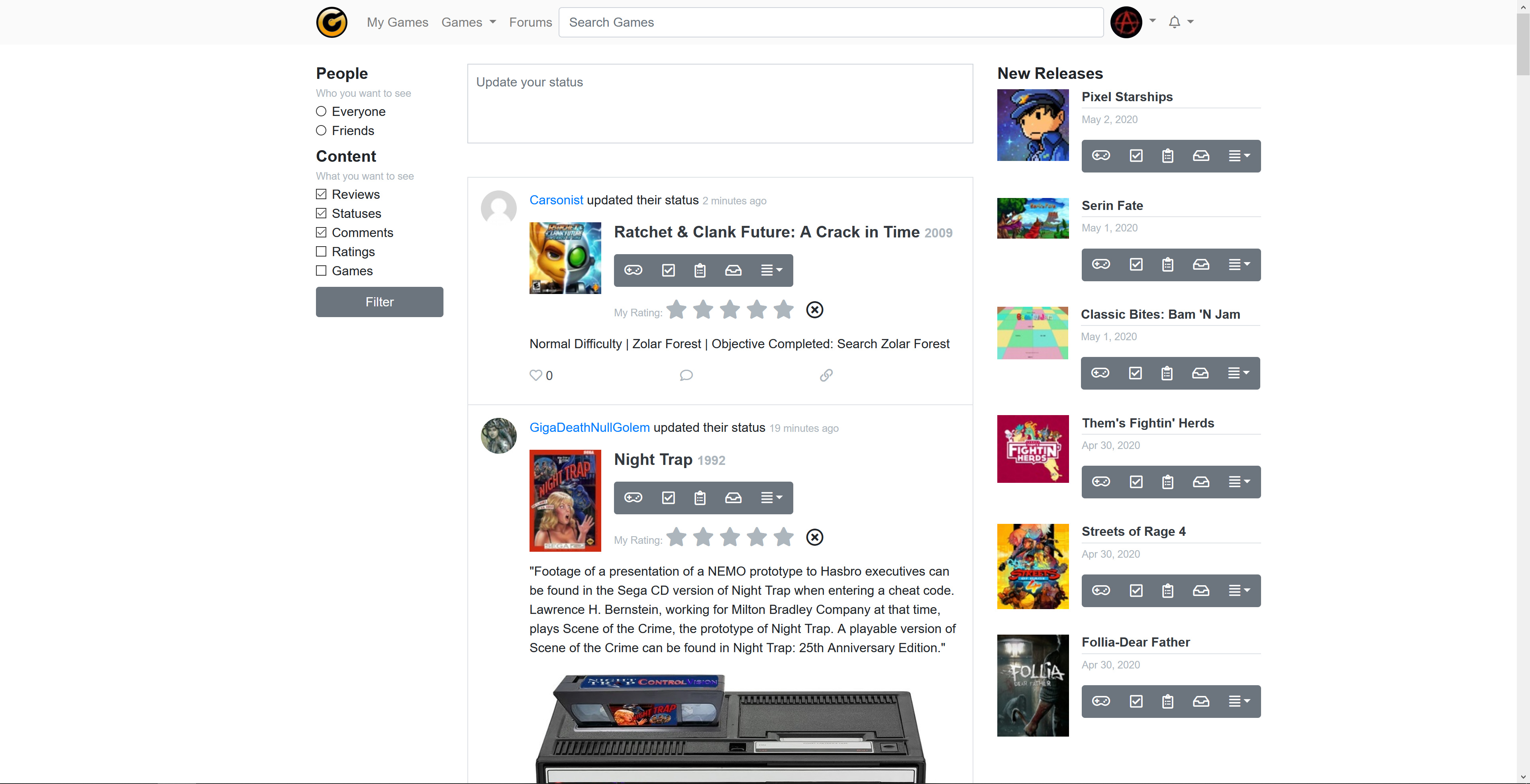
Here’s a basic one but the number of replies doesn’t show up.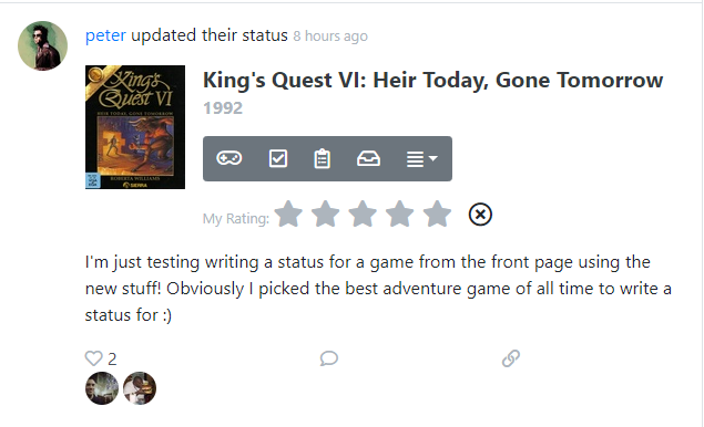
2 Likes
Don’t know how I missed that! I’ll get it fixed.
1 Like
mais je ne pense pas that the language filters are going to happen anytime soon.
Filtering out users would do the same trick. Plus people could finally ignore my 10 reviews a day. ![]()
2 Likes
It looks really good @peter! Scrolling through the feed on mobile feels nice too 
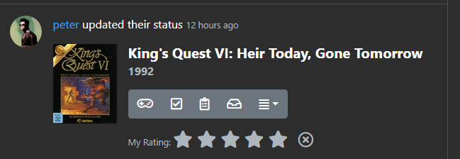
One thing that feels a teeensy weensy off to me is the little  icon showing next to a game even if you’ve never given it a rating/review. Super minor, and it’s not gonna destroy me if we leave it as is
2 Likes