Do you just mean that it’s a couple pixels off in terms of lining up? I noticed that too. It bugs me, and I’ll definitely get it fixed, I just kind of had it on the back burner.
2 Likes
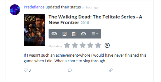
I believe that what they’re pointing out is that is not necessary to show the X for removing your rating if there is no rating to remove.
3 Likes
I fixed the image thing. I broke it when I fixed the word wrap stuff earlier.
3 Likes
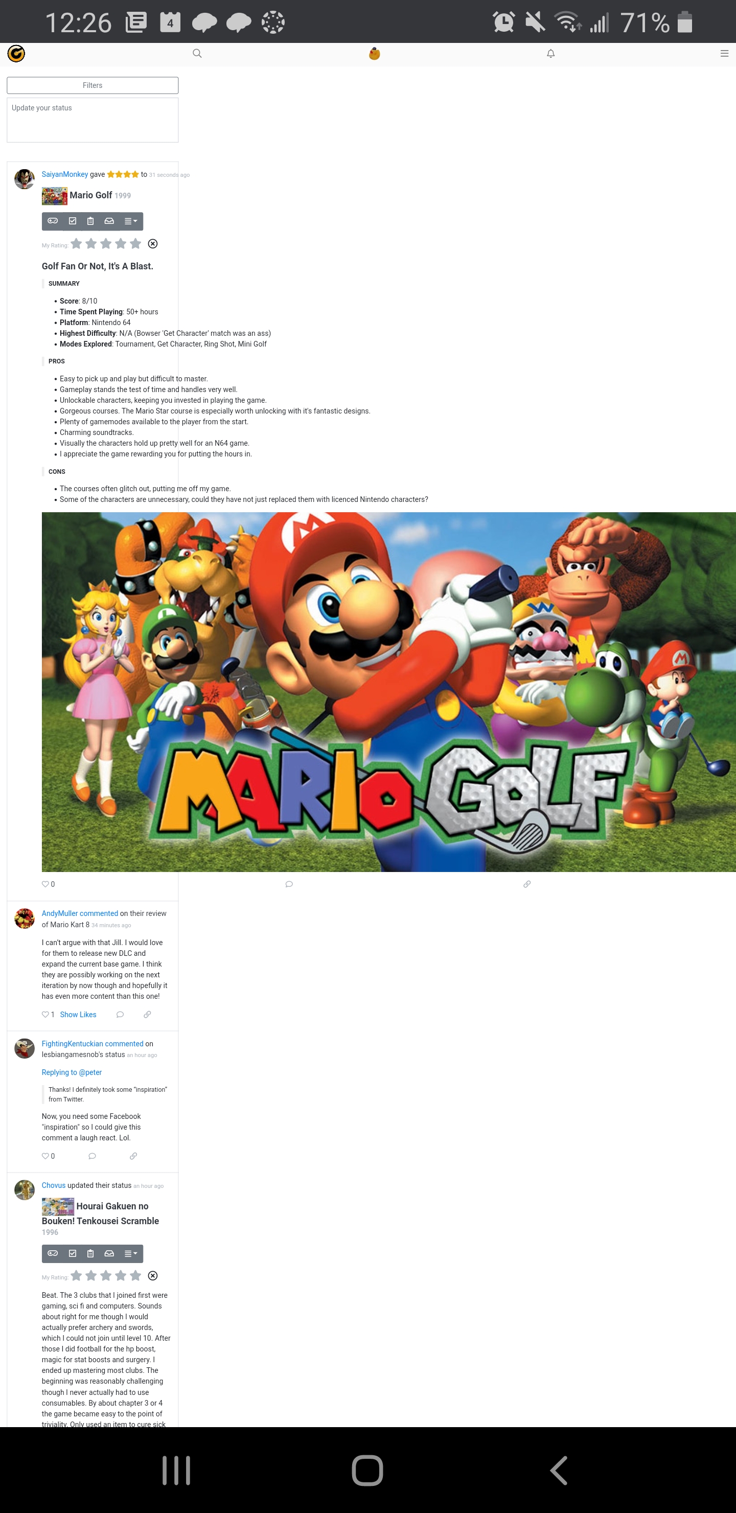
I’m liking the update for the most part, especially the status box being smaller until clicked, though I see no option to collapse it once it’s been opened.
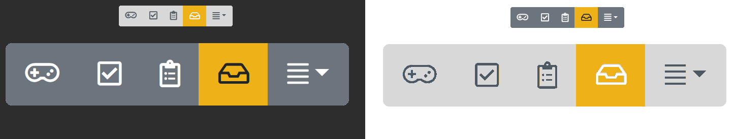
I have a couple of gripes though. Previously, the ‘add to shelves’-bar was blue when clicked, against a light grey/white background. This made it really pop, and very easy to get an overview with high clarity. Contrasting this to the new dark grey on the slightly darker grey, it really makes me need to stop for a little bit and almost squint at it despite wearing my glasses to see what’s going on.
There’s also some issue with inefficient use of space, as a user of an ultra-wide monitor (21:9, 2560x1080). Together with the new ‘like/comment/share’-buttons spaced layout, it seems more generally oriented towards phone users with an upright monitor orientation and touch interface.
Perhaps a Gold feature could be to pick your own colour-scheme for the ‘add to shelves’-bar. I know I’d pick each button having its distinct colour, haha.
2 Likes
I’m not too sure what to do about the inefficient use of space. All I’d really be doing is making the middle part wider, which might make it look better. I’ve played around with making it take up the whole screen no matter what, and it looks bad. I think having the filters section be sticky might make it feel a little less empty on big screens. You’re definitely right though, it’s a mobile interface blown up onto a big screen.
As for the contrast on the buttons, I can get behind your complaint. I played around with a couple of other ideas before ultimately settling on what you see now. What do you think of these:
Those were the other two options I was debating between before doing this. I almost went with the second one, but I just didn’t like the starkness of it.
1 Like
I went ahead and changed it to the grouvee yellow contrast. I think it’s a nice balance. Let me know if it doesn’t have enough contrast for you. I also did the sticky thing that @maimegidola suggested. I think it’s kind of awesome!
Keep the comments flowing. I’ve got a few more fixes I’m working on in the short term. Comment counts showing back up in the feed are next, the read more button after that, and I’m going to be shifting the layout a little bit when you’re on a phone so that there’s not that weird empty column on the left side as you scroll.
I also snuck in the ability to remove friends today. A million people have asked for it recently, and I finally built it. Just go to the friend’s profile page, and click the Remove Friend button. I need to add a confirmation, but it’s there.
1 Like
That yellow looks very nice.
Re: use of space. I don’t fell very strongly about it right now. It’s on par with the 3-column twitter layout, so I think it’s fine.
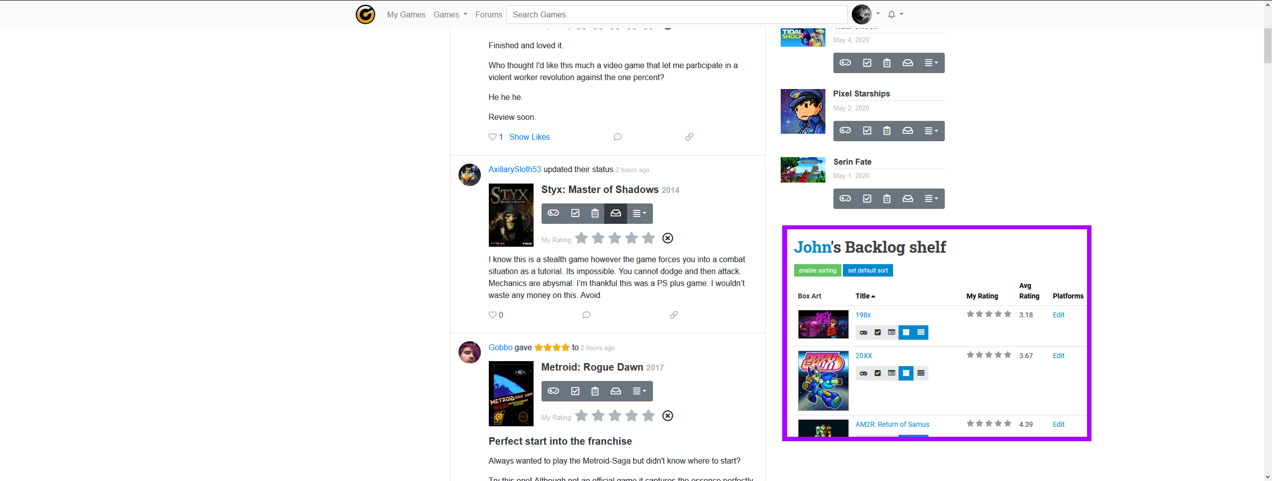
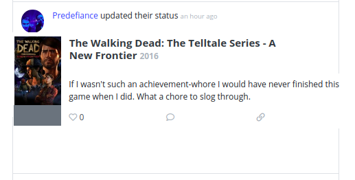
I do think that status updates use up a lot of space with the game information. For example, here less than half the space is the actual status update.
Maybe all those nice buttons can be hidden away in a hove menu or something like that. Maybe it’s too many changes, but maybe something like this (very rough sketch done in GIMP):
(the gray rectangle represents where the hover menu would appear)
Love it! The stickied filters are so nice 
Re: the X. What @killerstar said about no rating to remove, thanks for clarifying!
I know you’ve adjusted the quote blocks on the front page for the regular light theme, but I guess the front page’s new dark theme has to be tuned separately? It’s currently indistinguishable on the front page (block quotes with “old” dark theme on other pages are still fine).
I’m liking the yellow! Just to be overly nitpicky though, I think light mode would benefit with an inverted but slightly darker colour scheme.
I made a quick mock-up image to demonstrate what I mean:
To the left is the current one on dark mode, to the right is the mock-up on light mode. The small ones are placed on the opposite sections for reference.
Regarding hiding objects as per @killerstar 's suggestion, I personally prefer how currently they’re persistently displayed. Always having a quick overview on things is probably one of my favourite things on this site.
I think I agree that a fully covering mid-section wouldn’t look nice, as I tried messing around with the width and see what it would look like. But a slightly wider mid-section might still be optimal for widescreen users, and increasing max width doesn’t seem to affect non-widescreen users at all as the site nicely wraps itself up depending on the size of the window.
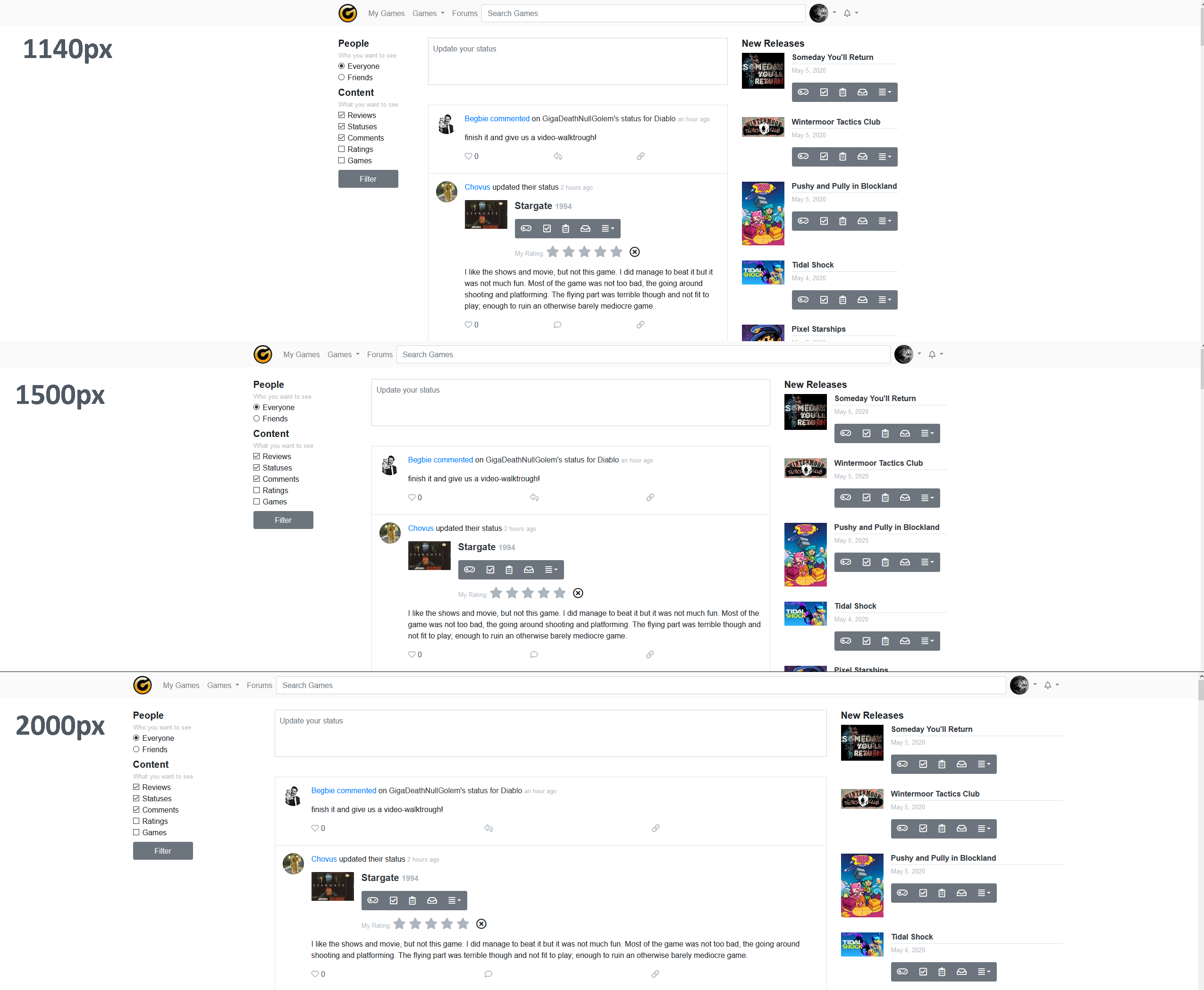
Although 2000px max-width wasn’t very nice, I think closer to 1500px would be nicer than the standard 1140px.
I also tried it out on a standard 16:9 (1920x1080).
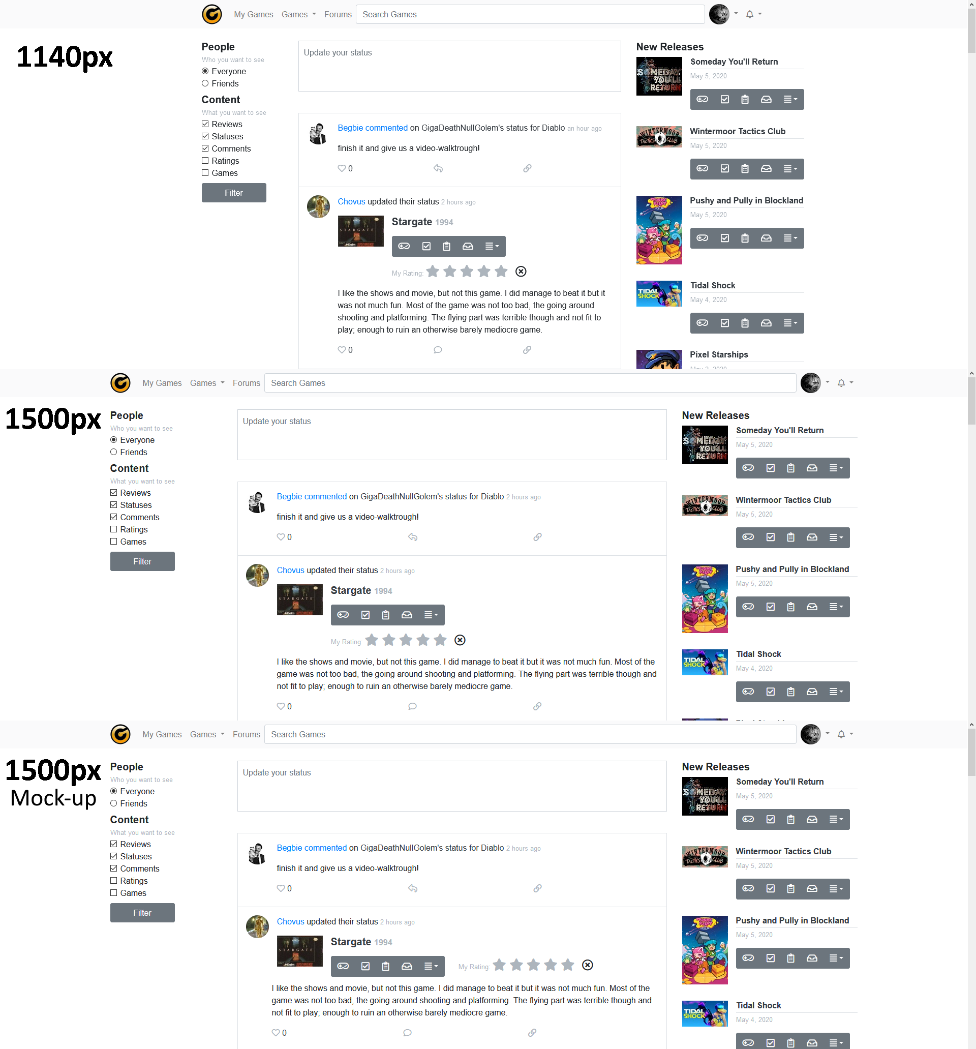
I think I’m still preferring the 1500px here too.
Going back to @killerstar 's suggestion, I also added on the last image a thought on a possible solution for more optimal spacing of elements if the width allows for it. It could wrap and unwrap depending on monitor width and as a result lead to less bloat for widescreen users. Might be too much of a hassle though.
The buttons get particularly spaced as one increases the width, which is a tiny drawback. I personally love how their design is here on the forums, so implementing that button design for non-phone users on the front page too would be really nice imo.
1 Like