New shelf page ideas

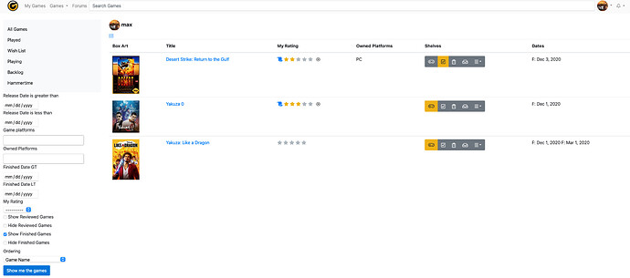
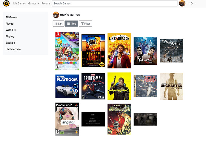
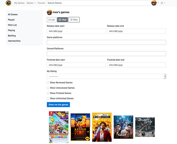
OK, bear with me because these are still pretty rough looking, but this the idea at least for the new shelf pages. I need help with design ideas, and other data filters/sorting ideas.

What am I missing? How intuitive do the naming of the filters seem? I have no idea how I’m actually going to display this stuff. I think it looks pretty bad to just shove it under the shelf list like they are now. I was thinking of having a button that would slide everything out from the right side of the page.

Screen Shot 2020-12-22 at 1.51.32 PM Screen Shot 2020-12-22 at 1.51.45 PM

The other thing I want to ask about is tiled box art display. Which one of these do you prefer? I can never decide if I should make everything uniform and crop like in the second one, or just make the height uniform and display the entire box art.


Throw me some more ideas and feedback please!

7 Likes

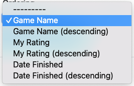
i’d suggest adding “(ascending)” after the equivalent sorting options, just to make it easier to choose at a glance. yes, you can infer it from looking at the descending option, but every half-second is valuable when it comes to intuitive design. everything else looks fine to me, but to be honest i prefer the spacing between text blocks more in the current design. maybe you should have a section similar to the one at the top left (the one with a grey background) for the sorting options to make it more uniform and pleasant to the eye?

i don’t mind different widths for cover art, but the spacing between images is essential, i’d say. i don’t use the current tiled option because it lacks spacing between rows and that bothers me personally. i think some sort of overlay option over each image when you hover over them is also almost essential in this type of sorting, like here: ‎margesherwood’s Watchlist • Letterboxd (if you hover over each poster, there’s 3 main options you can click without leaving the page). sorry, i’m really bad at technical terms when it comes to this stuff lol.

3 Likes

I agree with okdesuka, it really needs space between rows. I also think the hover idea is great, it can show the stars and shelves options for that game. Personally I prefer equal widths, but I don’t think any one is better than the other one.

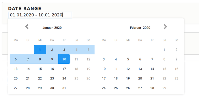
The date ranges are kinda clunky, I think something like this works best.

The side bar also looks a little bit too crowded and it’s hard to distinguish between input fields and labels, I would put some more space between each field.

But everything looks really cool! Great work.

3 Likes

Thanks for sharing these, @peter!

Some thoughts and suggestions…

  1. I would love to see the filters and controls competing less with the list of shelves. Something I’ve done for a lot of clients is collapse the filters behind a toggle with summary on small screens, then snap those features to their own sidebar when there’s enough space.
  2. It isn’t super clear what the “Ordering” dropdown does that the table headings do not. If you have two controls for accomplishing the same thing, you might consider consolidating… maybe show a “sort” dropdown only when there’s not enough space for the table headings?
  3. My brain has some trouble reconciling a “Show Reviewed Games” checkbox and a “Hide Reviewed Games” checkbox. What happens if both are checked? Or neither? If these are boolean options, you might try consolidating them into one on/off checkbox. If they are distinct options, consider giving this area a “Show” heading and trying to re-word these so they’re all positive… instead of “Hide Reviewed Games,” “Show Unreviewed” or something like that.
  4. Different users are going to have different preferences when it comes to the tile view. What I will say is that varying the width is going to result in a “ragged edge” all along the right side, which isn’t very pleasing to the eye. This is why sites like Pinterest vary the height, because you only see that once you’ve scrolled down or loaded everything. Alternatively if you’d like to keep things uniform, you could experiment with using a script to “fill in” the gaps while showing the entire cover art… https://codepen.io/tylersticka/pen/774cfb02fff49e412d909328d385b30e

Exciting to see this!

4 Likes

That’s all a good idea. I think that’s mostly what I’m planning on doing. Although I’m kind of debating about putting it behind a toggle even on a large screen. Maybe have it come in from the side if people want to use it.

Fair enough. I’ll probably only put that drop down on there if in tiled mode.

This one is definitely tough for me too. I’ve gone back to saying “Show” for all of them now. It’s a little weird though because if you check both Show Review and Show Unreviewed, you actually get nothing because it’s an “and” filter. I don’t know if that’ll confuse people or not.

I definitely stole the css from this :slight_smile: I’ve not really done anything with grid layout. It’s pretty much perfect for this. I think the fill in is kind of the best compromise here. Did you do some kind of calculation for the background colors on those, or did you just manually do it?

5 Likes

CSS Grid Layout is awesome! I highly recommend Grid by Example if you’re ever interested in diving deeper or solving a problem with it. (Eventually we’ll be able to use it for masonry layouts without JS.)

You can see how I calculated the background colors in the “JS” tab. I used a script called Color Thief. It would be more performant to do these calculations on the back-end: If I remember correctly, I think Grouvee runs on Python? If so, I’m pretty sure there are Color Thief ports or equivalents if you wanted to do this ahead of time and spare the browser some CPU cycles.

There are some pretty insane things people can do by dividing images, sampling the dominant color from each segment, and then making that a background gradient that displays while the image loads (example)… but I think that would be overkill for images this small!

4 Likes

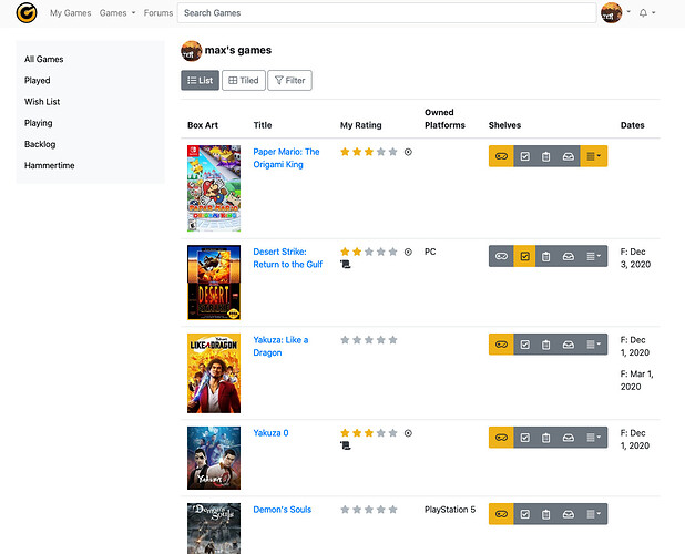
OK, here’s some more screenshots.

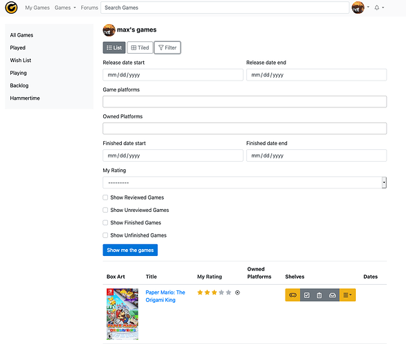
I’ve taken some of your ideas here, and updated the look. It’s starting to take shape fairly quickly. I don’t like the Dates column display currently. Not sure what to do there.

I don’t like the way the shelf buttons look in this thing either. Maybe they should be stacked, or some other kind of UI component.


5 Likes

I think this is really great progress, @peter!

I was confused at first by “List,” “Tiled” and “Filter” being together. Maybe “List” and “Tiled” should be more of a joined “Button Group” style, and “Filter” could be pushed to the opposite end?

With regard to your comments about the shelves and dates: You may be running up against the limitations of the table layout at this point. Since all the elements are arranged horizontally, horizontal real estate is put at a premium, which is an issue since the rating and shelf controls are also horizontal.

There are several possible solutions to that… you could change the display of shelves to a more concise summary (a la Goodreads), you could make the box art smaller, you could omit columns.

But if I were in your shoes, I’d step back and think about why you’re using a table for this in the first place.

One reason is probably sorting: It’s intuitive to click the table headings to sort. But, you’ll probably need an alternative sorting UI for small screens anyway… is it possible this function could be handled a different way?

Without sorting, the function of the table is to provide clear headings for each cell of data. But how much does that data rely on those headings? “Box art” is very apparently box art, and there’s nothing else that looks quite like the titles. Ratings are apparent since they’re stars, and shelves lack a label elsewhere in the app so why would they need one here? Dates already have “Start” and “Finished” labels, which are self explanatory.

So there might be a way to arrange each item that’s more space efficient. Here’s a quick and dirty example, and then one I was playing with several months back.

Anyway! You have options. (And no hard feelings at all if you don’t take my advice, this stuff is my job so I’ve got a very thick skin!)

4 Likes

I think everything you’re saying is dead on. I completely forgot about that mockup from a few months ago. I really like the idea.

It’s kind of silly I haven’t thought of that idea before. The list view really could and should be laid out like the /games/ page is. You can get so much more info in the vertical space in a much more efficient manner. Plus like you’ve kind of implied, it will look much better on a small screen anyway not having to worry about horizontal real estate.

If I don’t listen to you, I’m a dummy! I can build backend stuff really fast. I can’t do design for shit. It’s never been my strong suit. Thank you for all the help! I’ll throw some more screen shots up here later this weekend.

4 Likes

That is looking sexy. Is it too late to pitch more ideas? Something I’d loved to see are subtractive filters. The use case for this is that I have a shelf for VR games which, on occasion, I want to exclude from searches, e.g. give me all games in my backlog which are not VR games.
So far I haven’t found a way doing that (including trying to guess url parameters that are not implemented in the gui).

4 Likes

Beat it to fit: i just noticed the tile thing the other day and like it the way it is. I dont find it looks that bad to have a ‘ragged edge’ and think it’s better to default to it rather than constrain the box arts… (Tyler’s suggestion is pretty optimal though in filling to create a standardized sizing template.) Your second slew of screens is very nice indeed! I don’t honestly ever use the ‘compact’ but that might not mean everyone does not have need of it.

Also that review favicon or w/e its called is pretty dope! When you click it does it take you to your review? How did we get by without that design feature?

I just want to say that since I use Dark Mode I don’t really see the site (beyond the forums) in it’s default formatting. You’ve done well with it. It’s a really nice color scheme. How does Dark Mode look with this color scheme? I notice the blue text of the grouvee color scheme and seems like it would be harder to read in dark mode. I think it’s a shame that the site looks so nice in default white mode when a lot of us really do enjoy the Dark Mode. If you switched to Gold on Grey it wouldn’t be as nice as the current white on grey but it would look pretty cool to have some of the color in some places… Maybe like the top of columns or titles of games on the site or other things… Oh wait I know,

Gold Membered: what would it look like if Grouvee Gold people had their names in yellow? Your thoughts on that one? I think it would look good but some people might not like that idea. I personally do though :slight_smile:

Halo-Effect I also noticed the circle portraits for Grouvee Gold changed on the feed and think that looks better.

It’s Hammertime!: I agree with the other sentiments posted already in regards to spacing. Tight spacing between shelf titles is better (for those of us that have 30+ custom shelves that’s gonna be a lot of scrolling up and down) the site currently is pretty compact and compact spacing works great.

Playing Played Wishlist Backlog Wishlist or Eenie Meenie Minie Moe? Heh i notice the order is changed in this screen. Being able to arrange these guys (and our custom) would be nice. For customs, I currently have gotten around it by using special characters. I kinda think it makes the most sense to have the playing shelf the first one up after all though.

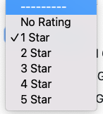
Ticked Off I kinda had a similar reaction to @tylerisrandom those boxes short circuited my brain for a second and i had to ponder what they meant. I think it’s a great idea to do filters for Reviewed and Finished though. That’s really good idea (And will hopefully lead to more reviews on the site!) But maybe Roll Downs for it would be more more minimal, intuitive and flow with the current design? If they were titled as ‘Display or Hide Reviewed Games’ with a ‘-----’ ‘Display’ and ‘Hide’’’ where the ‘-----’ is the default that would be ideal I would think. You could do the same with ‘Display or Hide Finished Games’
I think a lot of people will really like that feature because we know there are lots of shelves that people build that include finished games and they can look at those shelves in more ways with the feature.

Sort it Out Somehow: With more options added, I think it makes sense to move this to the very bottom (as you are considering) However, while I don’t use Date Added, or sort by avg grouvee rating why take them away? I may not sort stuff by that but I do look at them on the side there, i might even click the column to then sort it (which is gone) Are we getting rid of some of those data fields for some reason? They aren’t in the screen you share and that info is pretty nice when you run a search and can then click the columns to then sort by it (the way it currently works) The most useful one is Release Date, and I am known to sort stuff by that one, when actually running a search so def dont take that away!

good to see you still chippin’ away at it peter!
4 Likes

Looking good!

Re. the tiled view: I agree with the comments about spacing between images. Personally I prefer uniform sizes with cropping but I think either would look good with the right padding. I think it’s mostly the very wide/landscape images that take up too much space, so perhaps cropping might only be applied when the images have an aspect ratio wider than 1:1 or 4:3, for example? (Not sure how feasible that would be, coding-wise.)

There’re a few aspects of the old version I’d personally like to see carried over to the new design (maybe with a new look) that don’t seem to be visible in the screenshots: the ‘My Shelves (Edit)’ header in the left column – mostly for easy access to the ‘Edit’ link; a line/gap between the default shelves and the user-created shelves; and the Avg. Rating column. The last one just because this would be the main way I’d probably want to filter/sort Shelves, but I understand if this is being cut to make things less cluttered.

As the Release Date field is gone, I wonder if this info might be added (in full or just the year of release) after/beneath the title of the game, perhaps in brackets or distinguished by colour? Not as a ‘filterable’ field but just as an additional bit of visible info. (It can make games with the same or similar names distinguishable, esp. in the era of so many sequels/reboots/remakes.)

2 Likes

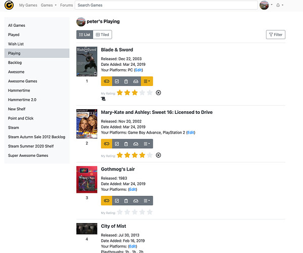
I’ve read all of everyone’s suggestions, and I’m still working on this. I just wanted to throw out another screen shot where I used @tylerisrandom’s idea to get rid of the table and show a summary. Definitely still a work in progress, but I like it better. I might even be able to “tile” these new summary cards, or whatever you want to call them. I will fix the spacing on the shelf names. I agree there’s too much space there probably.

2 Likes

This is great!

I think there’s probably an opportunity to make greater use of the horizontal real estate as space allows…

(What does the little scroll icon mean near some of the ratings?)

1 Like

Yeah, that’s probably what I’ll go with. I need to play around with it some more.

The scroll thing is just my quick and dirty way to slap up something to link to the user’s written review for a game. I’ll either change it, or try to make it more obvious to what it is.

2 Likes

Another idea that may be out of scope for your current changes, but I’ve noticed frequent confusion around what the different ratings mean since most people don’t see the alt or title tooltips. There may be an opportunity to make those more overt?

Screen Shot 2021-01-19 at 11.33.07 AM

3 Likes

Just want to second the subtractive filters idea, with the way I use lists this would be massively helpful to how I organize. I find sometimes when I want to add a shelf to create a category of a game, sometimes I have to then make a shelf dedicated to the inverse of that idea because there is not subtractive filter.

2 Likes

@peter Where did you end up putting the filters?
To have them slide in/out from the left/right sounds good.

For the Reviewed/No review option, the user should only be able to select only one of those options (radio button or a drop-down) to avoid the no results when both are selected.

What does the sorting look like now that the column headers are removed?

2 Likes

I’ll put the subtractive filter in. I think that’s an awesome idea.

2 Likes

They’re going to slide down from the top.

I’ll mess around with it. The dropdown might work. I don’t know why, but radio buttons that don’t have to be selected always bother me. Once you select one, you can’t unselect it, and I’ve never liked that.

Right now I have it as a dropdown under the filter menu. I think I’m going to put a little text dropdown underneath the buttons with the sorting options.

I haven’t had a whole lot of time to work on this the last couple weeks, but I’m getting back to it soon. I’m excited to put it out there because I think it’s already a way better experience than what we have, and it’s not even done yet.

3 Likes