I just stumbled over the Use new Shelf style toggle and decided to give it a spin. There are a couple of things I noticed. Let me just say that I’m aware that this is still a work in progress and you probably know a lot of this stuff already, so feel free to disregard whatever feedback isn’t new to you.
The good
- Love the new more rounded visual style
- The new header bar is probably my favorite thing about it, it looks so much more organized now
- Same with the shelves list, it looks like a proper part of the page now as opposed to just a random list of links
- The game list looks calmer and not as busy as the old one
The bad
- It’s not possible to sort by release date or added date
- It’s not possible to search for games in the current shelfanymore
The ugly
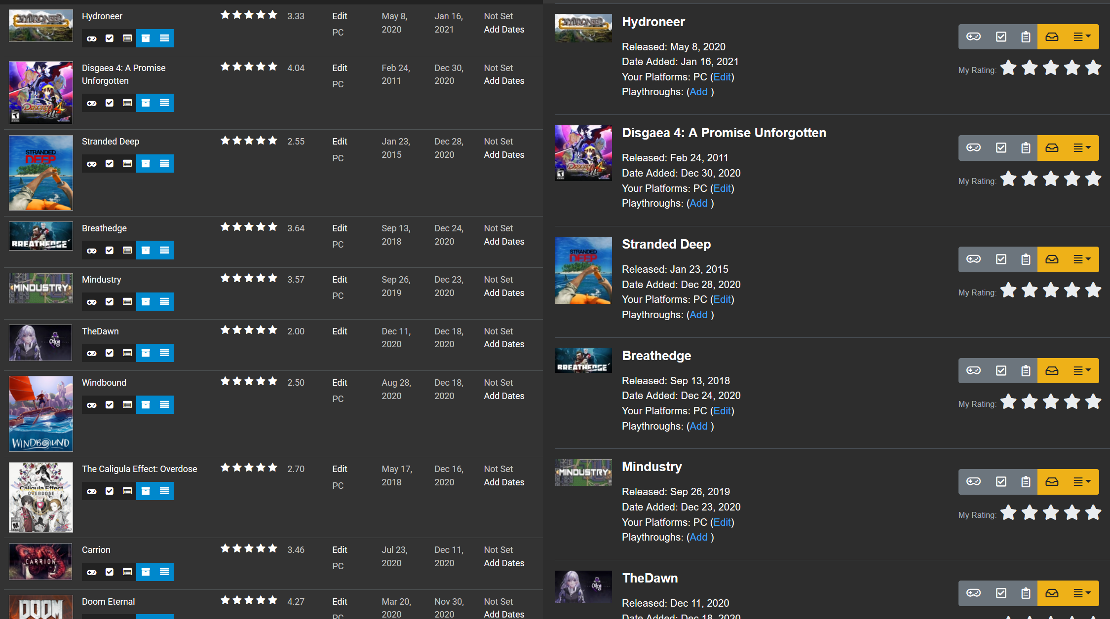
While I like the overall style of the games list, the old layout was much more efficient in terms of how it used space, both vertically and horizontally. In extreme cases the old layout displays almost twice as many games as the new one:
Thanks for the feedback! You can sort by release date now.
I’m working on the date added field. I’m going to tweak how it works I think. Right now that field exists on a per shelf basis, which is good, and will remain that way. I’m also going to add a field that lets you specify when you added a game to your collection that will persist across all the shelves. I don’t know if that makes sense, but hopefully it does!
As for the spacing, I will probably bring back a compact mode at some point if some just wants a quick list with a bunch of names on the page. Like you said, the new layout is less busy, but it needed to take up more space to do that.
Keep the comments coming!
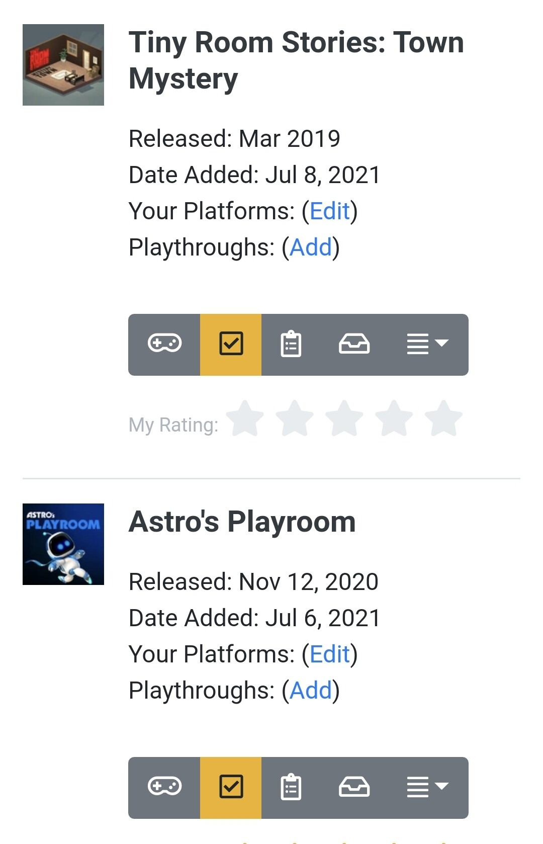
In the new List View, I think if the thumbnails were as tall as the text (so top of thumbnail starts at the top of the game’s title and bottom of thumb ends at bottom of playthroughs info) it might look a little neater?
Also, I noticed that if you have a list in which entries are numbered (such as this) the numbers appear under the game thumb in List View which looks a bit weird. Maybe if they appeared on/over it as they do in Tiled view?
As for Tiled View, I think it’d look much nicer if all the thumbs were of a uniform size/shape (I realise not all the images for games are uniform but maybe they would just have to be cropped?). Also - and I don’t know how easy it would be to do this - maybe when you hover over a game thumb it’s star score (and maybe other info) displays over the thumb?
Keep up the good work, Peter. It’s lookin’ nice!
Why not putting NOR option to filter shelves? I saw there are AND and OR, but not NOR. This way we can skip some not wanted shelves.
There are going to be negative shelf filters. I haven’t had a lot of time to work on Grouvee the last few weeks, so it’s been slow going, but it’s the next thing to work on.
Just a little bug it seems, but if you set the My Score filter to No Rating it doesn’t show any games.
Just want to say I’m really liking the look and feel overall of the new shelf pages. Nice work, and thanks. 
I’ve fixed this on my machine now. I’ll push the code up here in the next couple of days when I clean up a couple little features I was working on.
This bug has been fixed. I also added descriptions to shelves today!!!
If anyone wants to checkout the new edit shelf page, I would greatly appreciate it. It lets you reorder your ranked shelves with a drag and drop interface that isn’t as slow and garbage as the old one. It’s not perfect on a phone yet, but I’m working on it. Next up is the subtractive filters.
The way to get to it is to go to a new shelf page, and click the little box on the upper right with the edit icon. If it’s not intuitive, let me know. It doesn’t show up on “permanent” shelves yet.
Was a little confused at first, there is no “edit” button to add new shelves & see all the shelves, like on the old shelf page, so I couldn’t tell from the icon that it was to edit the description & rank per shelf. my mistake ^_^;
The page seems really seems really nice, intuitive & quick! You did a really nice job on the drag & drop feature. I’d never used the old ranked version but I may actually end up using it this way. Perhaps a description about dragging & dropping would be useful in a finished version, since I wouldn’t be able to tell without this post that it was possible. The numbered rank is also a great option & easy to use
Oh, and a question - am I supposed to be allowed to drag & drop titles even when my shelf isn’t ranked? It certainly lets me do that, & keeps the order within the edit page too after exiting, interestingly enough. It just doesn’t reflect the order outside of the edit page/show numbers.
That’s good feedback. I need to at least link to the edit all shelves page (and probably re implement it too).
Thanks! That’s what I was shooting for. I’ve started using it a lot more already because it’s a lot easier to use.
I just stuck an icon on the right side of the box that means drag and drop in most interfaces. Hopefully people kind of understand it from that.
Yes? I don’t know yet to be honest. The order is actually there behind the scenes either way. It’s probably confusing to be able to move stuff around like that and not really be able to sort it by that order if it’s not a ranked shelf.
The thing I need to do next with this page is let people add and remove games from their shelves from the page. I’ve found myself definitely wanting to remove games from a shelf.
My opinion:
most of the time, I don’t care one bit about seeing my ratings, the platforms I own the game on, or the dates it came out or I added it.
99% of the time I just need to switch them from wishlist to backlog, from backlog to playing, from playing to played, or something like that. I just need to see the cover, maybe the title, and the status bar.
In case I want to see or set those other info, I’ll just go to the game’s page and do it from there.
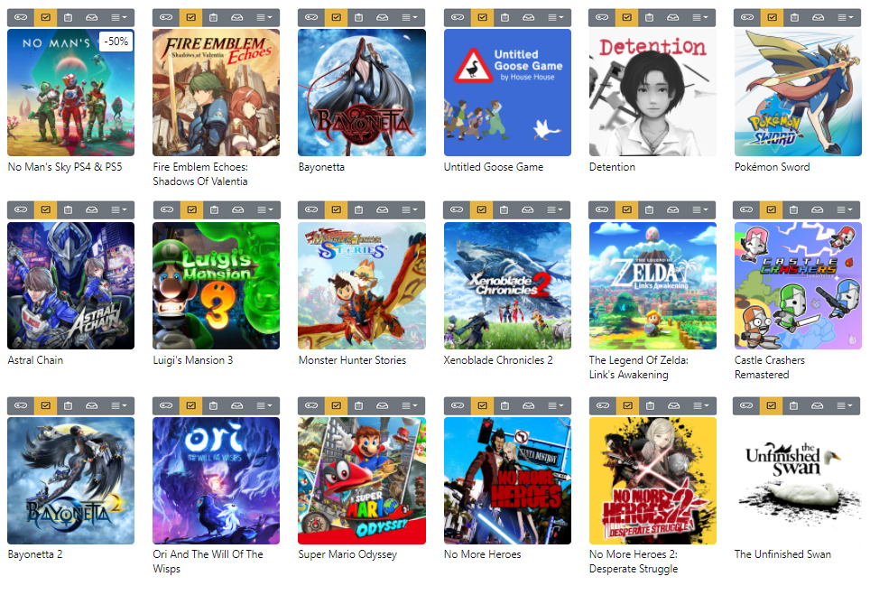
I would like to use the tiled view, but it lacks the most important thing, the status bar for each game.
Also, it hurts my brain how uneven the tiles look. I’d like all of them to have the same dimension, and their images to fit in it. I don’t care if part of the cover gets cut out, I already know what the full cover looks like, I don’t need an art gallery, I just need the page to be practical to use and search in.
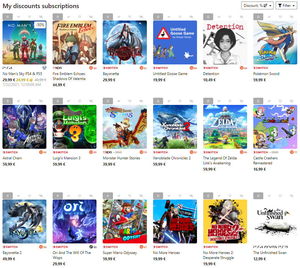
Look here below at how clean my page on psprices looks. (it’s a website where you subscribe to certain games and it alerts you when their prices drop on the shops)
They too have a practical and quick status bar above each game, and the tiles look even and well organized. In your case, you would have to display just the status bar, the image tile, and maybe the title, so you wouldn’t need the rows to have so much space between them, they can be much tighter than this.
I’d like to have something like this, also because the new style takes too much space compared to the previous one. I use grouvee mostly on the phone, and this problem is even worse there.
Just to add on how it looks on phone, previous style and new style compared.
From 6 games fitting on screen (just because of long names, otherwise there would be more) to just 2.
Don’t know about others but I have long long lists… it’s almost unusable like this, I immediately retreated to the previous style but it’s going to be a problem if that one goes away.
You’re definitely right it needs a compact mode. I’m working on it, especially for a mobile view. It also needs search, which is coming soon.
I like the look of psprice (although the amount of ads on the site makes me want to gouge my eyes out). This one is tough for me. Some people like the jagged full box art, some like the even look. One thing is for sure, there needs to be an overlay or something for the tiled look. I know you say it’s not an art gallery, but I do want the shelves to be able to be shared as something for outside people to look at.
Anyway, I love the feedback. I particularly like hearing from people who don’t like things. If everyone liked how this worked, I wouldn’t need to do a redesign.
Not my intention to sound too negative, I love and need grouvee, I’m also a donor. I tried many similar sites before grouvee but they all had serious flaws compared to it.
It’s just that the usability on mobile was worsening recently with the new style so I came here to check what was going on.
I spent a few minutes to give a closer idea of what I was imagining for a tiled view, just an idea, nothing too serious.
It could even be a new kind of view, not necessarily replacing the existing tiled view, even a new one with a different name.
Anyway I’m not adamant on having this kind of view, it was just an idea, I would just need any compact one for the new style, one that has just image + title + status bar and I’m all set.
Thanks!
I’ll figure out a way to get the buttons on the screen, but I stole @tylerisrandom’s idea for color thief on the tiled view just to see what it would look like. You can see it here: peter's Kotaku (JS) 20 JRPGs shelf
What do you all think of that look?
It’s only 5 months later, but the subtractive filter should be out tomorrow. I didn’t want to push it tonight because I’m going to bed and didn’t want to break the site right before I go to sleep.
I’ll post here again when it’s up. I know lots of people have asked for it, but I think you and @mmuffins were the ones asking for it the most.
Killer, thanks so much Peter!