I got the idea for this from a recent post on the main page, and found nothing similar …hence the creation!!
I wanna see what kind of cover arts, regional variants and advertisements different people love, hate, have nostalgia for or anything else. Just a nice highlight reel of these kinds of things for our favorite games, or our thoughts on specific ones and how effective they were or weren’t.
I personally have always been a fan of these type of minimalistic designs, they’ve always stood out to me. I also love when games have alt flip covers as well.
Fun topic. I like it when a cover (for anything—games, books, movies) can really stand out from the crowd and hold your attention for a bit. To be honest, not all that many games come to mind for me, since I’m so used to the typical templates that are used. If it’s just a character (or group of characters) standing there, not doing anything, I’m probably going to find it a bit boring. As for minimalist covers… That’s hit or miss, I suppose. Sometimes I’m intrigued; sometimes I’m thinking “well, that tells me nothing about the game.” I don’t care for covers that’s just a logo, a symbol, or a stylized title.
Off the top of my head, there are five game covers I find particularly memorable. I’ll start with one for now:
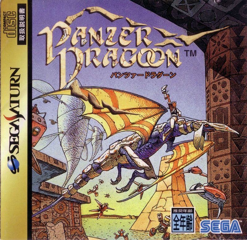
The world of Panzer Dragoon was heavily inspired by French comic book artist Mœbius, and he got to do some artwork for the game, including what would become the cover for it in Japan. Sadly in other regions, basic CG models were used instead (as “3D graphics” was such a big deal at the time). I’m a big fan of covers that use beautiful artwork, especially when they depict a scene (as in, something is actually happening in the drawing—not just “here’s a character reference drawing”). In this case, we see a hero riding an armored dragon, flying across a desert planet with flying vehicles in pursuit. Immediately establishes the game’s unique blend of sci-fi and fantasy (and since the hero is holding some kind of gun, you can even guess the gameplay will involve shooting). Colors that really pop. And just the right amount of detail to get across what’s happening, but also not overdoing it and feeling cluttered or messy.
I remember the cg cover distinctly actually, and i feel like i missed out. The art work on that brings back some nostalgia of older fantasy novels and the like for me. Its a really cool piece and it is sad we dont get much like that anymore. It is definitely something i would have looked at as a kid and been interested in.
Old Dragon Quest covers go hard, one day i’m going to find someone to print me some custom tshirts with the NES/SNES covers for DQ1, 3, 4 and 5 in them.
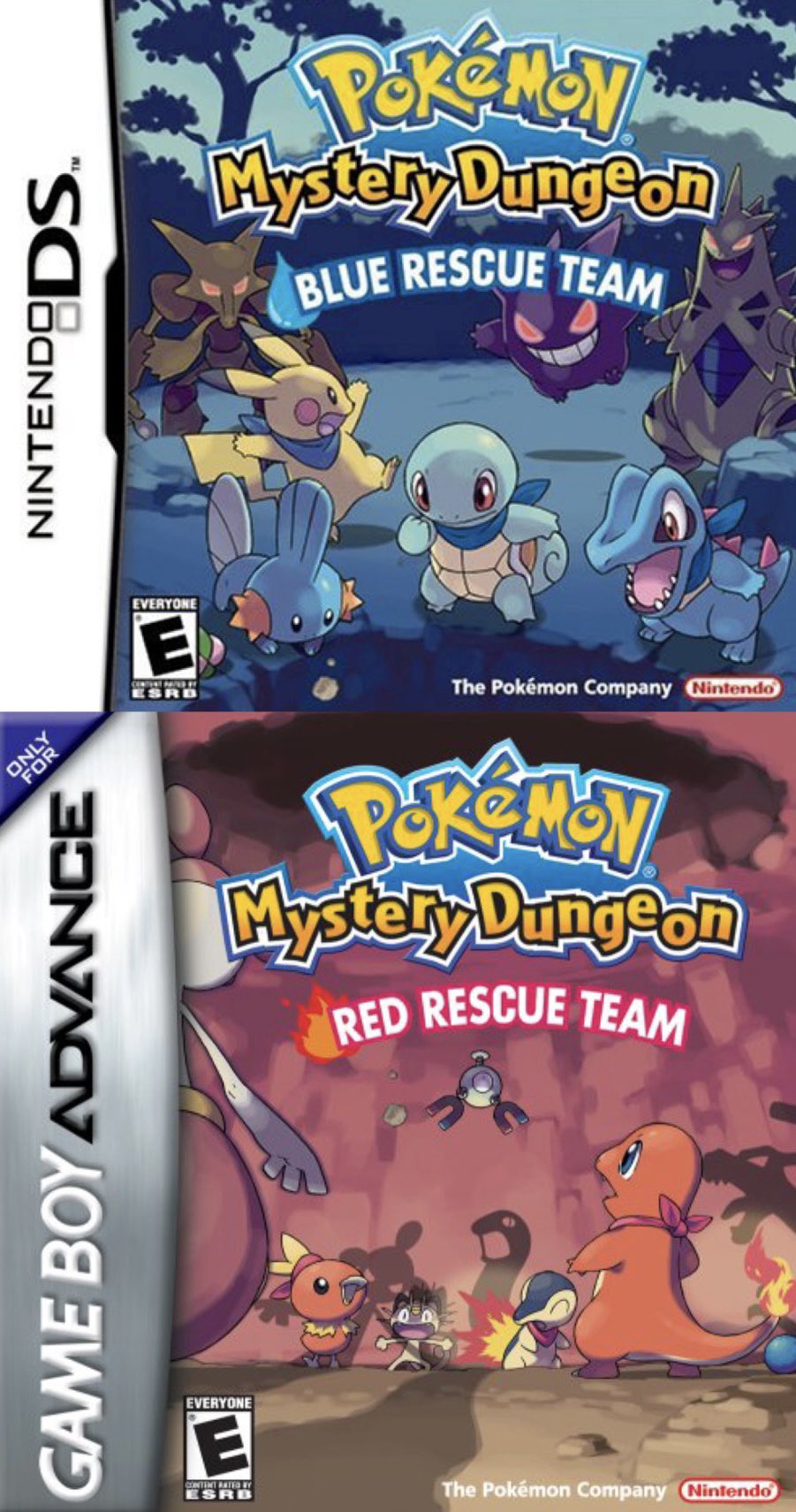
It’s not that old yet (…right?) but I always loved the art for Pokemon Blue/Red Rescue Team and how they sorta link up with the blue team looking down at the red team.
The cover for Silent Hill 2 is really iconic and while it’s a bit odd in that it doesn’t feature the main protag, I think it still sets the atmosphere for the game pretty well.
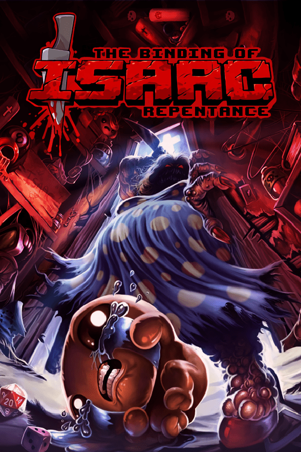
And finally, it might not count since I don’t think it ever made it to a physical game cover, but the “cover art” for The Binding of Isaac: Repentance is awesome. Reminds me of the old Goosebumps book covers.
As for my hall of shame, I think I’m not a fan of covers that are simple to the point of being generic. Like for example the cover for Fire Emblem: Shadow Dragon.
They could have done a lot to make this more exciting. Even just making the cover almost anything but the really boring brown/yellow color would have helped.
I love Mother 3 but this art is just…oof. I love the logo, but the blinding red is painful to look at, and there’s so much creativity in the game itself you’d think they could let some of it spill over into the box art. Doesn’t seem like it did though.
Dragon quest covers just work you know? Theyre pretty solid across the series for the most part, and they immediately are recognizable to the series as well. The old ones that feature action scenes are great.
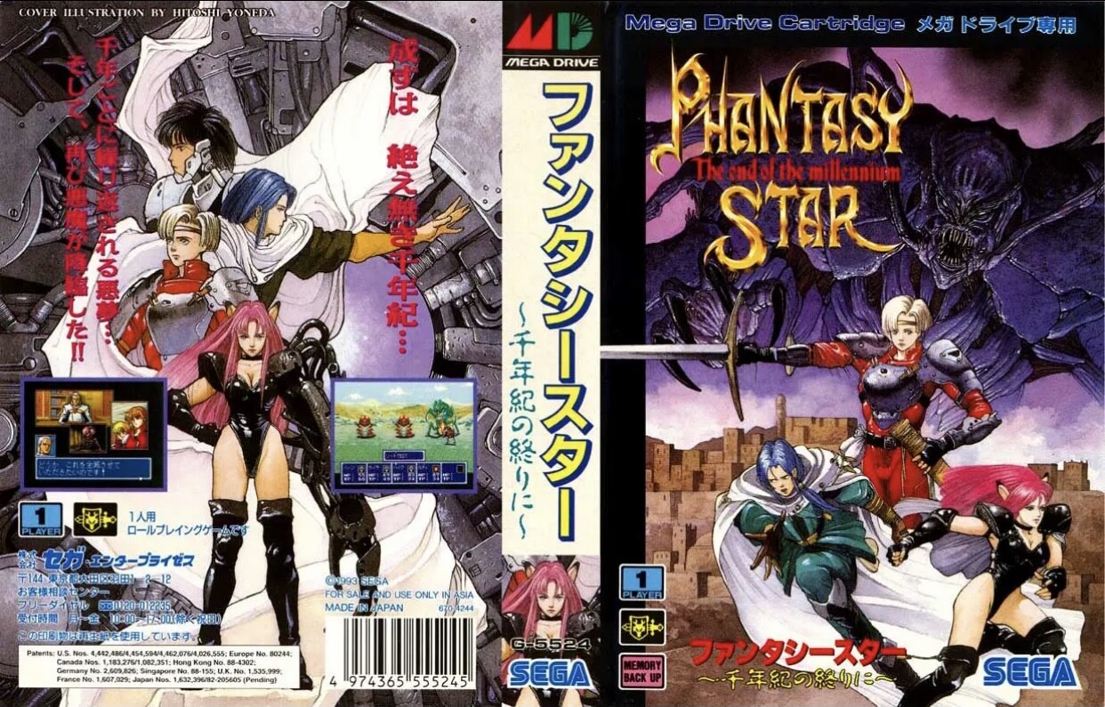
Ya know, i dont think ive seen any phantasy star covers before, but it is pretty cool, and another example of regional differences that america got the short end on…
I could tottally see the goosebumps connextion for binding of Isaac. I used to own a ton of those books and it looks like a darker version of one of those. Silent Hill 2 is a well known one for sure, and honestly i think it fits. Its got that mystery and slightly off feeling that pervades the game.
Yeah, those both are pretty sad. I like minimalism but those are too minimal. A solid color and a name usually doesnt work. I cant actually remember a single good fire emblem cover.
The Black Gate almost works…Almost… juat beacause rhe texturing makes me think if some kind of stone door. Grim fandango is another great one i forgot about! Really captures that movie poster feel to me.
I have no mouth reminds me of some of William Gibson’s books. Theyre cyberpunk esq and a bit like a fever dream half the time. It looks like something he would come up with for a cover.
Ive got Master of Darkness on my 3DS, but i didnt realize how much detail is in that cover. Its really cool, and i agree the monsters in the cape is a nice touch.
As for Doom, while i personally dont love it, its definitely iconic. Nearly anyone with even a brief knowledge of gaming knows that one.
I havent seen that one, only the other version with the character sitting with augumon at a table in what looks like a diner. This one seems considerably happier lol. I also like how its more like theyre saying “hey come hang out” rather than the stare down on most covers.
Did some digging to try and unearth nightmare inducing covers that I remember from my childhood and it’s taken me on a nostalgia trip like i’ve never experienced before. I’ve seen so many covers that I haven’t seen in 20+ years and completely forgotten about. Watching gameplay of some of the games has brought back a lot of memories and very distinct but hard to describe “feelings” associated with when I used to sit and play them; it’s almost like a taste, a smell, a sensation… it’s hard to describe, or am I just attempting to describe nostalgia in too much detail?
Anyway, some personal favourites of mine in no particular order. I love the “ugly” ones and the more “aesthetical” ones all the same!"
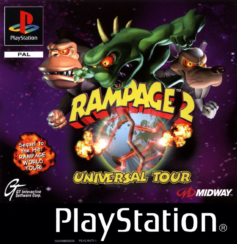
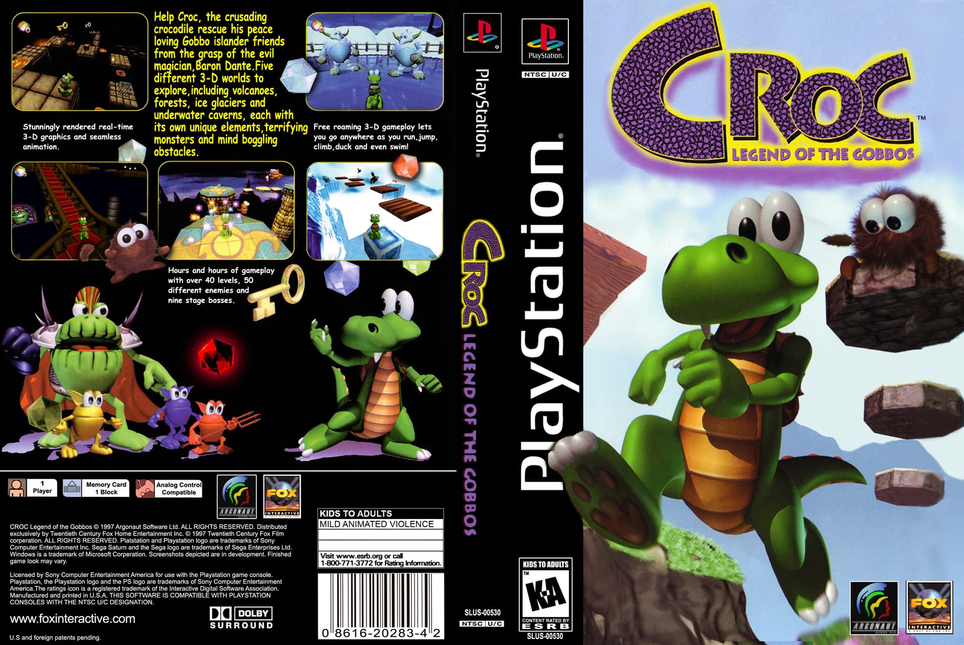
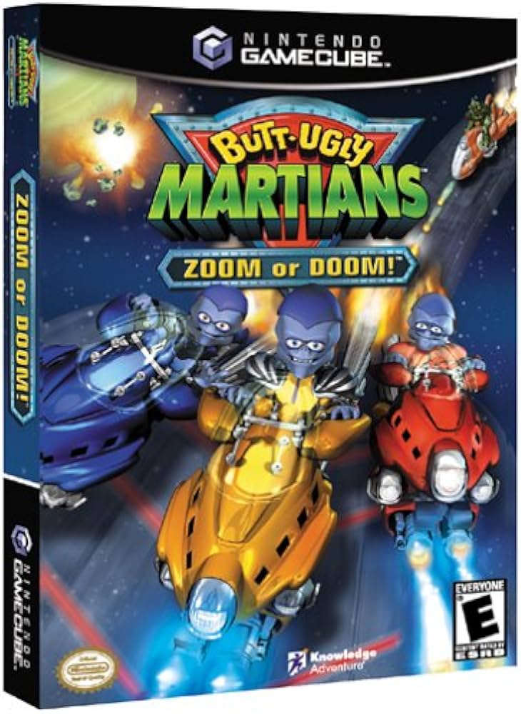
Rampage world tour was one of my favorites on ps1 for a while, fun game, didnt know they did a sequel. I remember croc vaugely, dont know that i ever saw a cover tho. Butt ugly martians looks like a rip off of biker mice from mars lol.
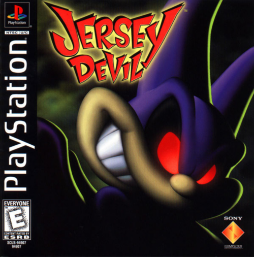
I also remember playing a demo for jersey devil, wanting to buy it but then never finding a copy in stores anywhere.
As for that chess game…you got me, i dunno what the heck is going on either
Rampage was my favourite on PS1 for a long time too! I think they did a few games? all great in my opinion! Croc is pretty terrible now due to its controls but its got a lot of charm. And i’ve never played Ugly Martions but i’ve got a copy of it for the gamecube sitting on my shelf and its been staring at me for the past 5 years. Can’t get it out of my head now