Could you add a Tile View to display games like IMDB? Just the box art, the game title (year) and the user’s rating, no frills.
It’s on the list to do. I actually already kind of have a template for it. I imagine it would look something like this page:
https://www.grouvee.com/user/peter/ratings/
That’s a page that shows the latest ratings for a user. It’s also kind of scary I’ve barely rated anything this year because I’ve hardly played anything!
Excuse me to revive this thread. I’m still dying for the minimalistic Tiles View on Grouvee…
IMDB’s example:

Please make this happen!
Keep Track of My Games’s example:

P.S. I am a donor to Grouvee, Keep Track of My Games and Backloggery.
4 months passed. May I ask for Tile View’s implementation in the foreseeable future?
I’m really sorry about being so slow. I really do want to get this done for you. Most of the work I’ve done has been optimization work, and a few little features when I can. I’ve got a 3 month old at home, so he’s been taking up most of my time. I will try and move this to the top of the list.
Thanks for your patience and being a Grouvee Gold member. I really do appreciate it more than you know.
https://www.grouvee.com/user/peter/shelves/?sort_by=&dir=desc&dateFrom=&dateTo=&num=100&compact=2
Do you think you want the shelf buttons and rating buttons in a tiled view?
Let me know what you think. You can view your shelves in tiled mode by changing the dropdown under View Options to Tiled.
That’s really neat. I actually like this more than I thought I would.
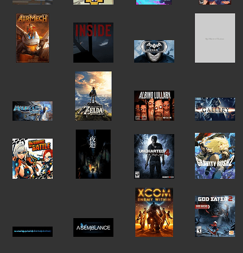
One little thing. Do you think you can squeeze the name of the game somewhere in there? It’s not an issue for 95% of all games where the logo also contains a huge version of the title, but some of the game covers get a little too enthusiastic with their font, which makes it hard to read, and some games don’t have any cover art. Like the top right and lower left in this screenshot:
Many thanks for this breakthrough!
Absolutely, I’d like to see the shelf bar and the user’s own rating bar too. I just love them in the big fat form factor as seen in the user’s homepage.
https://www.grouvee.com/user/HIMSON/
Otherwise, the Tile View will only match Darkadia at best. They have a nicer background TBH.
If you hover over the box art for a second, the title will pop up. I played around with the title being fully displayed, and I thought it looked a little weird. Maybe I’ll post some different screenshots and see what you think.
That’s funny. That was the thought that went through my head when I first saw my collection that way. I really like it with the dark background (which is a secret advertisement for Grouvee Gold!)
Ah, yes, you are right, I didn’t notice that. I suppose it’s my own fault for not having the patience to wait some two seconds to find out if an element has a tooltip.
