I can’t believe it’s been over four years since I started using Grouvee! My backlog just dipped below 40 games for the first time since, and I happily renewed my Gold subscription. Thanks, @peter!
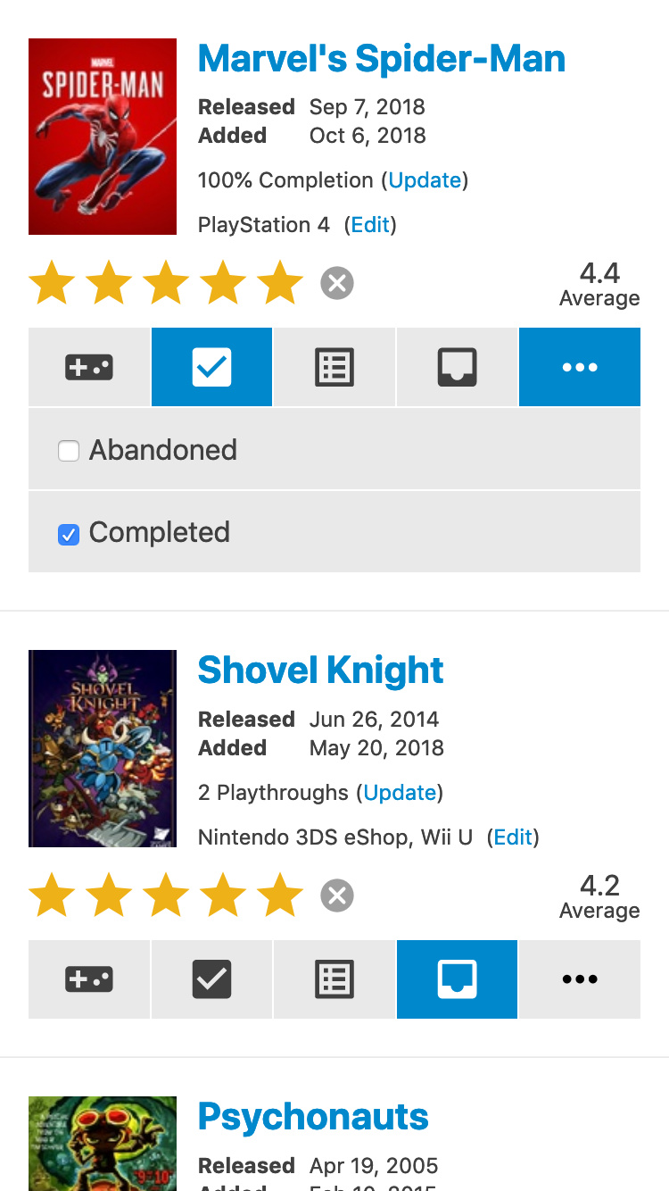
I’m a web designer by day, and recently I was trying to brush up on some of my CSS Grid Layout knowledge. I like to learn things with actual content, so I used one of my Grouvee shelves as inspiration and made this small screen redesign of each row:
You can try it out in your browser or your phone, but it’s only optimized for small screens, and it’s super rough… the ratings and shelves are interactive, but nothing else is. It’s also more of a UX-focused wireframe, I didn’t spend a lot of time on the visual design of it. It was really just a test bed for trying new stuff.
I personally dislike unsolicited redesigns. It’s super easy for someone to revise something with only a few of the features fleshed out and no understanding of the technical constraints. But a friend encouraged me to share it as website “fanart,” so I figured why not?
I’ve been meaning to come on here and tell you how cool this looks. Way better than anything I’ve made! I have no idea what I’m doing when it comes to design
The site is due for some UX touch ups for sure. I don’t know if I’d want to do a whole redo, but that’s probably what it would take at this point. This layout/UX also looks like it would be the way to go if I ever get around to building an iOS app. I want to do that so bad, but I’m almost scared to. I think the site might get too big if the app was any good
Thanks for being such an awesome Grouvee person! Wish I could afford to hire you to do the front end stuff because like I said, I barely know what I’m doing.
And in defense of the current site’s UX, before Grouvee I’d tested and abandoned three different sites with similar goals. One of those looked very nice but was lacking in features (and database completeness), one was functional but too focused on the collection of physical games, and one looked and felt like using a bulletin board from the mid-to-late 90s. This was the only one that had all my games on it and made it only a click or two to add or remove them from shelves, which was exactly what I wanted.
This layout/UX also looks like it would be the way to go if I ever get around to building an iOS app. I want to do that so bad, but I’m almost scared to. I think the site might get too big if the app was any good
My business partner just wrote a book about Progressive Web Apps. It’s a way of progressively enhancing a site with certain app-like features. Might be a nice middle-ground if you ever feel inspired to bring an app-like experience to devices without having to make an actual app.