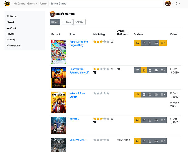
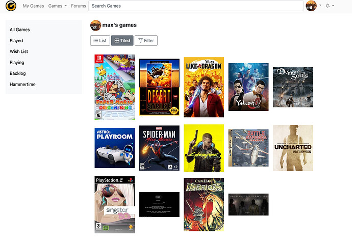
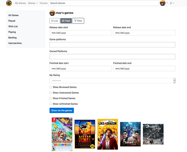
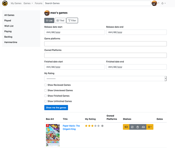
OK, here’s some more screenshots.
I’ve taken some of your ideas here, and updated the look. It’s starting to take shape fairly quickly. I don’t like the Dates column display currently. Not sure what to do there.
I don’t like the way the shelf buttons look in this thing either. Maybe they should be stacked, or some other kind of UI component.


