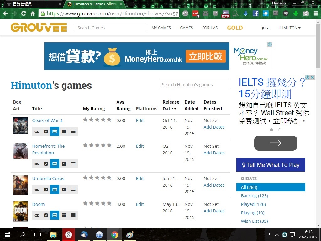
I wish there can be changes in the page layout, esp. in the My Games sector. Mind shredding some light?
Large game box art, large backlog status bar, large star rating bar (as in status) & large platform box (if only platform insignia…)
Night view toggle
Sorting preference cookie (e.g. release date near - far)
Elimination / customization of columns to reduce clutter (i.m.o. date added, date finished, avg. rating) Afterwards, there should be plenty of space for (1).
I’ve been meaning to respond to this for a couple of days.
I’ve got a compact view of the shelves in the works still, but I’m a little confused about one of your suggestions. What do you mean by large star rating bar? Do you just mean a large version of the stars?
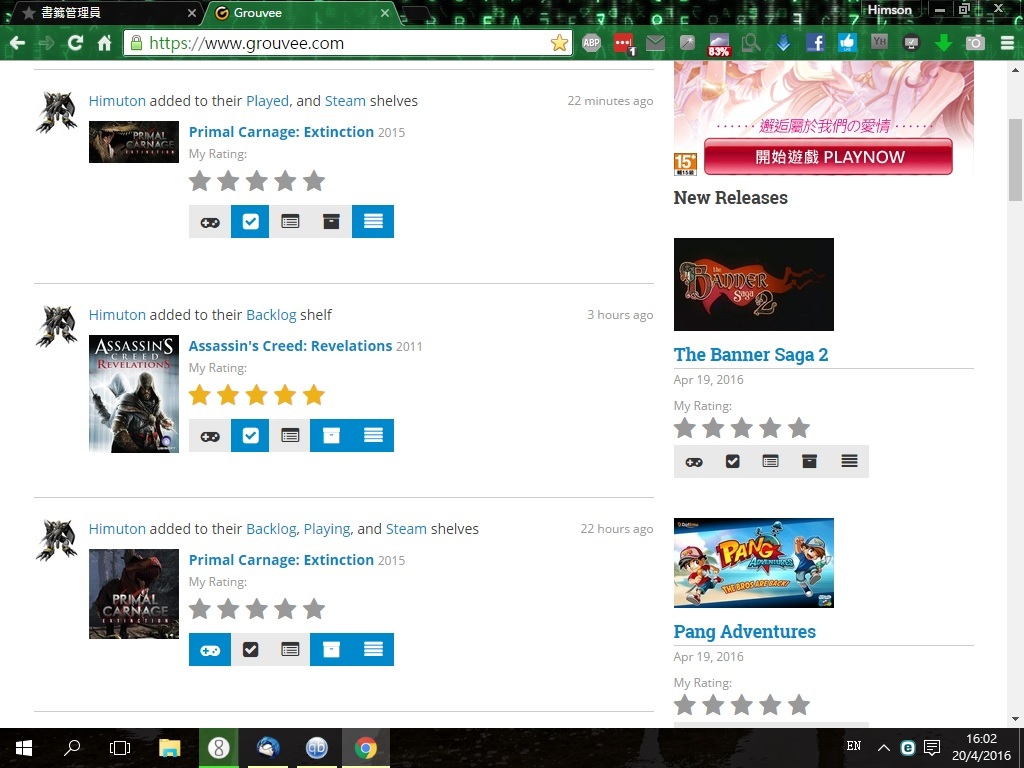
In contrast, My Game page has extremely small box art. The star rating bar size and the backlog status bar could have been big like on the Status page if only worthless columns like Date Added, Date Finished, Avg. Rating were removed.
BTW If there were people who enjoy the chore of data entry, they should have stayed with Backloggery…